 MegaMegaTypeType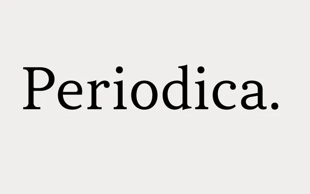
A neutral transitional serif by Andriy Konstantynov, spanning nine weights with true italics and Cyrillic support, designed for sustained reading across both print and screen.
About
Moderate x-height and restrained stroke contrast give Periodica an unobtrusive quality well suited to long-form text, from non-fiction books to on-screen articles. The family covers approximately 130 languages including basic Cyrillic, and includes small caps, five sets of digits and a range of OpenType features across 18 styles. Its deliberate neutrality positions it as a reliable workhorse serif rather than a distinctive display face.
Classification
Explicitly described as transitional serif, with moderate x-height and moderate stroke contrast — hallmarks of the transitional style that bridges old-style and modern serifs.