 MegaMegaTypeType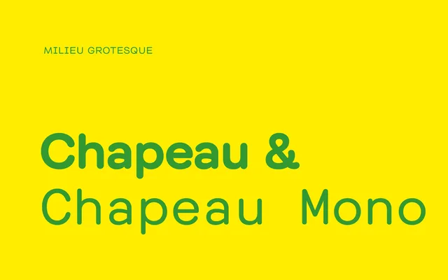
A low-contrast geometric sans-serif from Zurich-based Milieu Grotesque, rooted in IBM's rare Doric typewriter face and refined across six weights with a mono companion.
About
Designed by Timo Gaessner and first released in 2010, Chapeau takes its cue from IBM's Doric – one of the few proportionally-aligned typewriter faces of the late 1960s – distilling its geometric simplicity into a clean, low-contrast sans-serif with rounded terminals. The family spans six weights with matching italics and includes a mono variant, giving it genuine range across editorial, branding and UI contexts. Revised and expanded in 2016, it has appeared in Dazed and brand work for AIGA Eye on Design.
Classification
Low-contrast geometric sans-serif with rounded terminals, drawn loosely from IBM's Doric – one of the few proportionally-aligned typewriter faces of the late 1960s. Simple geometric construction with careful width control produces an efficient, contemporary quality. Revised and expanded in 2016. Includes a matching mono subfamily.