 MegaMegaTypeType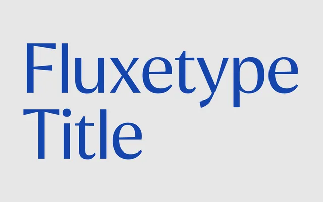
A high-contrast humanist sans from Nikita Kanarev designed for subheadings, callouts and logotypes, available in seven weights across three optical sizes.
About
Fluxetype Title raises stroke contrast beyond what is comfortable for extended reading, giving each letterform distinct character while staying short of full display exuberance. Seven weights from Thin to Black are offered across Petit, Normal and Grande optical sizes, with the Petit cut proving particularly suited to logotype work where proportions must remain tight under scrutiny. A variable font is available alongside static OTF and WOFF2 files, and OpenType features include alternate glyphs, Bulgarian and Serbian localisation forms, oldstyle figures and standard ligatures.
Classification
Described as sitting at the intersection of humanist sans and serifless roman, with raised contrast beyond reading level; this positions it firmly as a high-contrast humanist sans-serif designed for subheading and mid-scale use.