Split Rail
Matteson Typographics · Steve Matteson
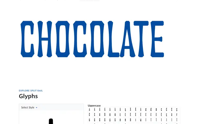
A three-width ultra-condensed gothic revival of William Page's No. 142 (1882), reimagined by Steve Matteson with beveled stroke endings and flared stems for a rugged, pioneer-era character.
About
Derived from William Page's 1882 wood type specimen No. 142, Split Rail carries the hallmarks of 19th-century American display typography: tight proportions, beveled terminals and flared stems that create a coarse, angular texture. Three widths — Condensed, Regular and Wide — extend its utility across narrow headlines and logotypes. The design evokes rural Americana, suited to branding that draws on frontier or agrarian references.
Classification
Ultra-condensed gothic revival derived from William Page's No. 142 (1882), with beveled stroke endings and flared stems characteristic of American wood type display faces.