Goudy Lining Gothic
Matteson Typographics · Frederic Goudy, Steve Matteson
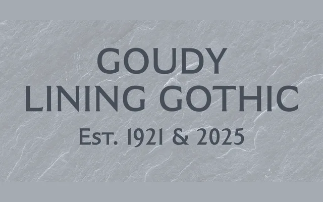
Steve Matteson's expansion of Frederic Goudy's 1921 capitals-only Lining Gothic into a seven-weight family, preserving the subtle terminal swells that distinguish it from a plain grotesque.
About
Originally designed in 1921 as a single-weight set of capitals, Goudy Lining Gothic was never commercially released, existing only as a historical curiosity until Matteson redrew it and extended it across seven weights from Thin to Black. The defining characteristic is a slight swell at each stroke terminal, stopping just short of forming a true serif and giving the letters a restrained calligraphic personality unusual for a gothic. The family is positioned for display work: packaging, branding, signage and headlines.
Classification
An all-capitals display sans with subtle swells at stroke terminals that hint at incipient serifs, placing it in a historical transitional zone between pure grotesque and serif letterforms. Originally a single-weight capitals-only face by Goudy, expanded by Matteson into a full weighted family.