Firth
Matteson Typographics · Steve Matteson · 2025
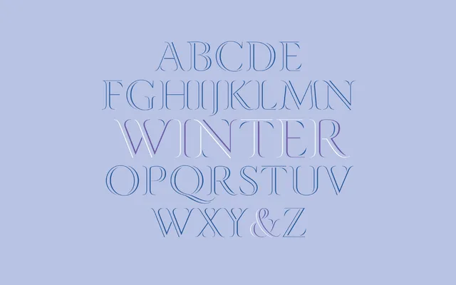
A lightly outlined decorative capitals typeface designed by Steve Matteson in 2025, drawing its narrow, flowing forms from the shapes of Scottish and Irish coastal inlets.
About
Firth consists of roman capitals rendered in thin outlines, with proportions and movement evoking the sinuous geography of coastal firths. Two weights, Light and Regular, make it best suited to large-scale applications such as book covers, initial letters and luxury branding. The narrow construction lends the letterforms a sense of elegance rather than decorative excess.
Classification
Decorative all-caps roman typeface with light outline construction. The narrow, flowing outlines and capitals-only focus place it firmly in the display category, unsuitable for body text.