Carnero
Matteson Typographics · Steve Matteson
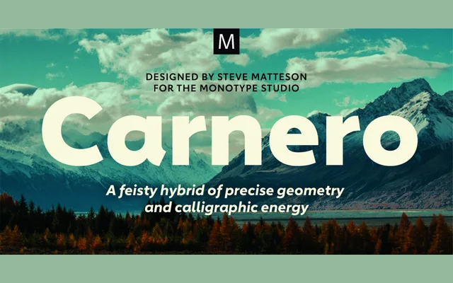
A 12-style hybrid sans by Steve Matteson that fuses geometric structure with calligraphic movement across six weights with matching italics.
About
Carnero takes its name from the Spanish word for ram and combines the rational geometry of contemporary sans typefaces with the dynamic, calligraphic energy more typical of humanist designs. The family spans Light to Black in six weights, each with a matching italic, offering range for publishing, branding and packaging. Where geometric sans designs tend toward austerity, Carnero introduces a liveliness that makes it more adaptable across display and text applications.
Classification
A hybrid of humanist and geometric sans traditions, Carnero blends the rational structure of geometric sans with the calligraphic energy and organic movement typical of humanist designs. The calligraphic influences distinguish it from purely geometric sans typefaces.