 MegaMegaTypeType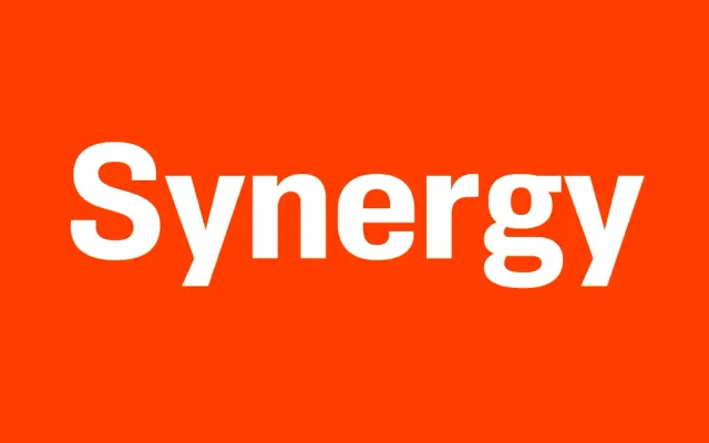
A nine-weight clean grotesque built from a 1981 idea for a friendly, rectilinear sans, with a two-story g as its main point of character.
About
Synergy revives an idea Simonson had in 1981 for a friendly sans with rectilinear forms and very few angles, a design he compares to Univers. Fairly even stroke widths give it a uniform look, broken up mainly by a two-story lowercase g, and its weight range runs from Hairline to Ultra with matching italics and small caps, comfortable enough for text and versatile enough for display.
Classification
A clean, rectilinear grotesque in the Univers tradition, classed sans-serif with a two-story g as its one point of character.
Weights
HairlineThinLightRegularSemi BoldBoldExtra BoldBlackUltra
Languages
Latin Extended
Tags
grotesquecleanvariable-fonttextdisplayunivers-adjacent