Shequalin
Mark Frömberg · Mark Frömberg
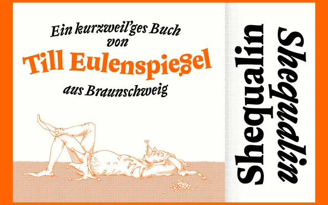
A text typeface with four weights and independently drawn italics, designed for satirical, dadaistic and humorous literature, with deliberate rhythmic oddities woven into the reading flow.
About
Designed as a TypeMedia master thesis at the KABK in Den Haag, Shequalin pairs roman and italic cuts drawn independently and merged afterwards, creating a sense of tension and contrast that sets it apart from conventional text families. Four weights in each style are complemented by a range of symbols and vignettes intended for typographical play. The typeface targets literary contexts where personality and wit are assets rather than distractions.
Classification
A text serif with independently designed roman and italic cuts that are intentionally contrasted against each other, creating an expressive tension unusual in conventional text typefaces. The deliberate oddities and dynamic rhythm place it in an expressive rather than neutral text serif tradition.