 MegaMegaTypeType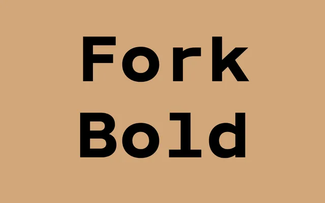
A bold geometric sans from MA-MA Type, presented with characteristic restraint and a focus on a single weight.
About
Fork Bold is a standalone bold weight from MA-MA Type's Fork family, emphasising geometric construction with what appears to be a distinctive lowercase 'a'. The foundry's sparse presentation reflects a stripped-back design philosophy, allowing the letterforms to speak without contextual noise.
Classification
The repeated lowercase 'a' specimens suggest a geometric or humanist sans construction; the name 'Fork' and the minimalist presentation point to a geometric sans with distinctive character shapes.
Weights
Bold
Languages
Latin
Tags
geometricsans-serifboldminimalcontemporarydisplay