LDN Westminster Text
London Type Foundry · Paul Harpin
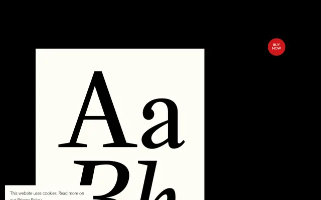
A book text serif designed by Paul Harpin with longish crisp serifs, a flowing italic and full numeral sets suited to footnoting and indexing in print and on screen.
About
Designed by a working book and magazine designer, LDN Westminster Text draws on the humanist serif tradition, with an upright stance, minimal distracting detail and a weight that tends towards the dark end of the spectrum. The family includes Regular, Italic, Bold and Bold Italic, with attention to punctuation scale, numeral sets, fractions, superiors and inferiors for typographic completeness. A low data-point construction makes it viable for screen use alongside print.
Classification
A book text serif drawing on the humanist tradition, with longish crisp serifs, upright stance and moderate contrast informed by historical faces such as Caslon, Garamond and Jenson. Designed explicitly for extended reading in print and on screen.