LDN Shadwell
London Type Foundry · Paul Hickson
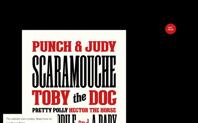
A narrow, woodblock-inspired display serif in seven weights, distinguished by diagonally emphasised crossbars that align with a set of purpose-drawn connector words at the same angle.
About
Designed by Paul Hickson and named after the East End district of London, LDN Shadwell draws on woodblock printing traditions with its narrow proportions and diagonal crossbar treatment. A selection of connector words – with, and, at, for – are drawn at the same diagonal angle as the crossbars, creating a consistent rhythm across setting. The family includes a variable font when the full package is purchased, and is positioned primarily for packaging and book cover work.
Classification
A narrow, woodblock-inspired serif with diagonal emphasis on crossbars and matching diagonal connector word glyphs. The ornamental construction and packaging-oriented application place it firmly in the display category.