LDN Modern
London Type Foundry · Paul Harpin
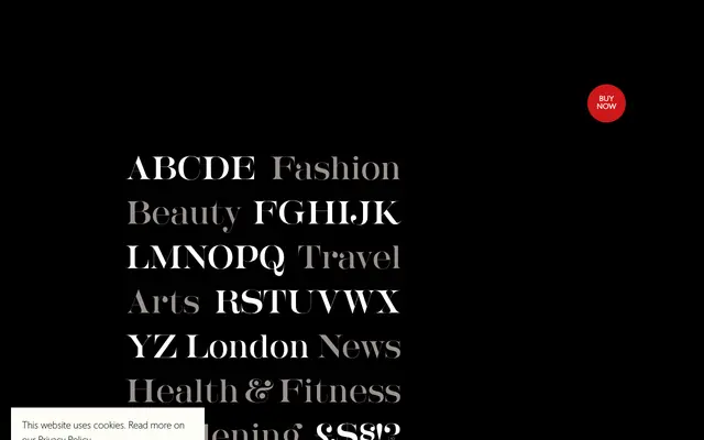
A high-contrast didone display face with ball terminals, feathery serifs and hairline strokes, designed for headline use and influenced by London magazine typography of the 1960s.
About
Designed by Paul Harpin and refined with additional incidental characters by Paul Hickson, the face draws on the editorial energy of 1960s London publishing. Its extreme stroke contrast, ball terminals and fine bracket serifs are best exploited at large sizes on screen and in print. A lower-contrast companion, LDN Modern No2, was released in 2020 alongside a matching italic.
Classification
A high-contrast didone-style display face with ball terminals, hairline serifs and ultra-fine strokes, characteristic of the Didone genre and intended primarily for headline use at large sizes.