LDN Merton Sans
London Type Foundry · Paul Hickson
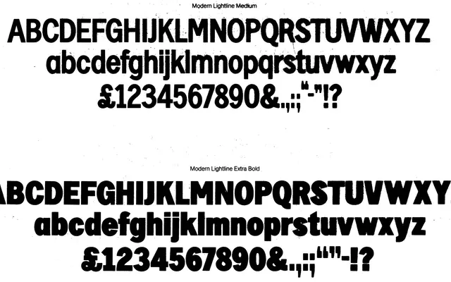
A neo-humanist sans expanded from Pat Hickson's 1970s Modern Lightline design, offering seven weights with matching italics and distinctive ink-trap-like stroke junctions in the lighter cuts.
About
LDN Merton Sans traces its skeleton to Modern Lightline, itself derived from ATF's Lightline Gothic, then substantially reworked and extended by Paul Hickson into a 14-style family. Open apertures, a large x-height and short descenders support text legibility, while the narrowing of horizontal strokes as they meet vertical stems – most visible in lighter weights – gives the design a quiet but recognisable character. Terminal styles vary across glyphs, with angled, chamfered and curved forms sometimes coexisting on a single character.
Classification
Described explicitly as a neo-humanist sans, derived from Modern Lightline (itself based on ATF's Lightline Gothic), with open apertures, large x-height and varied terminal styles characteristic of humanist sans design.