LDN Mammoth Woodblock
London Type Foundry · Peter Taylor
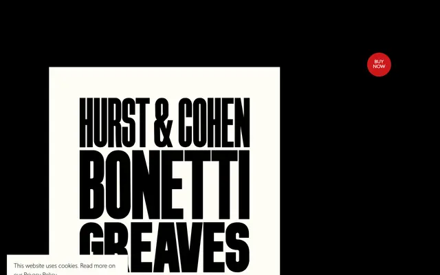
A caps-only woodblock display face in five widths, reviving a hand-drawn letterpress typeface originally used by Paul Harpin on the covers of BUSINESS magazine in the 1980s.
About
Based on hand-drawn artwork by Peter Taylor, derived from a woodblock letterpress sheet owned by designer David Hillman, the typeface's distinctive character comes from straight verticals paired with curved strokes that meet cap height exactly — a constraint born of preventing wooden letters from splitting under press pressure. Unlike the related LDN Mammoth, the rounded glyphs here carry no overshoots, giving the face a more rigid, monumental quality. Five widths run from a compressed No.1 to a medium No.5, all in a single heavy weight and capitals only.
Classification
Caps-only heavy display face derived from hand-drawn letterpress woodblock lettering, with straight sides and curved strokes capped at cap height — a structural trait originating from the physical constraints of wooden type printing.