LDN Kono
London Type Foundry · Eiichi Kono
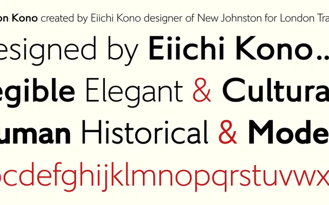
Eiichi Kono's humanist sans, created for a Japanese arts centre and expanded into a nine-style retail family tracing its lineage from Gill through his own New Johnston.
About
Originally drawn for the Center of Contemporary Art Kitakyushu under the name CCArt Sans, the design has been extended with two additional weights – Hairline and Extra Bold – bringing the family to nine styles across five weights, all with italics. The ancestry runs from Gill to New Johnston, the typeface Kono designed for London Transport, lending LDN Kono a credible pedigree in legible, functional letterforms. Extensive language coverage and OpenType figure sets and features are included throughout the family.
Classification
Described explicitly as a humanist sans serif, with lineage traced from Gill through New Johnston. The clean, legible letterforms and Kono's background designing New Johnston for London Transport confirm a humanist classification.