LDN Isle of Dogs
London Type Foundry · Paul Harpin
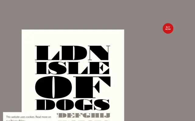
A single-weight fatface display type inspired by wider nineteenth-century handbill letterforms, named after the Isle of Dogs' short-lived 1970 declaration of independence from the UK.
About
Paul Harpin extended the proportions of his earlier LDN Fatface design after encountering a particularly wide sample sheet, finding the extra width amplified the angularity of the capitals and evoked the character of the London Docklands. The result is a high-contrast rational serif with massive vertical stems, hairline horizontals, thin unbracketed serifs and large ball terminals on the lowercase. It is available in a single weight with an extended Latin character set.
Classification
A high-contrast rational serif with ultra-thick vertical stems and hairline horizontals, placing it firmly in the fatface/display tradition. The extreme weight contrast and unbracketed serifs are characteristic of nineteenth-century display types.