LDN Hoxton Square
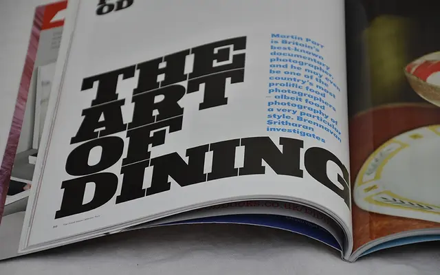
A fixed-width, extra black slab serif built around a strict square grid, designed for dense, tightly stacked headline setting.
About
Every character shares the same width and sits within a square cell, allowing headlines to be stacked in tight, uniform blocks with no spacing irregularities. Traditional overshoots on curved letters such as C, O and S have been deliberately omitted to preserve the grid's integrity. A companion Half Square variant lets smaller headlines align to the same baseline grid as the full-size version.
Classification
An extra black slab serif designed explicitly for display use, with fixed-width monospaced characters that fit within a square grid. The removal of traditional overshoots and emphasis on stackable text blocks places it firmly in the display slab category.