LDN Fatface
London Type Foundry · Paul Harpin
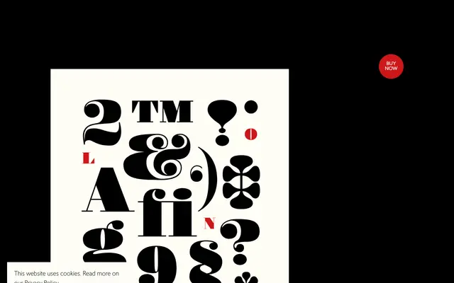
A fatface display type designed by Paul Harpin, taking character cues from his earlier London Modern, particularly in the ampersand and numerals.
About
LDN Fatface pairs extreme stem weight with thin unbracketed serifs and prominent ball terminals, following the nineteenth-century fatface tradition popular in poster and headline work. The design borrows specific formal details from Harpin's London Modern, lending it a degree of consistency within the London Type family. Available in a single Bold weight, it is intended purely as a display face.
Classification
A display fatface with extremely thick stems and bowls contrasted against thin unbracketed serifs and ball terminals, firmly placing it in the nineteenth-century fatface tradition used for headline and poster work.