LDN Farringdon
London Type Foundry · Paul Hickson
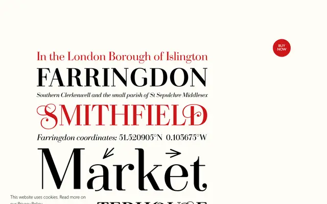
A two-weight transitional serif by Paul Hickson that tempers Bodoni and Walbaum's sharp contrast with rounded serifs, ball terminals and a set of engraving-inspired swash capitals.
About
Drawing on the high-contrast tradition of Bodoni and Walbaum, LDN Farringdon introduces softer details — rounded serifs, ball terminals and smoother final strokes on lowercase characters — to reduce the severity typical of the genre. The family comprises Regular and Bold with matching italics, totalling four styles. A set of initial swash capitals echoes steel-cut engraving aesthetics of the 18th and 19th centuries.
Classification
A transitional serif with high stroke contrast in the Bodoni and Walbaum tradition, softened by rounded serifs, ball terminals and smooth final strokes — a hybrid of classical and contemporary features.