LDN Borough
London Type Foundry · Paul Harpin
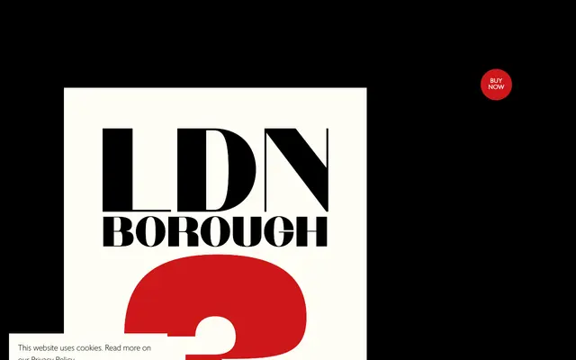
A single-weight high-contrast display sans with heavy vertical stems and fine horizontal strokes, named after the historic Borough of Southwark in London.
About
LDN Borough pairs with LDN Bermondsey as one of two high-contrast sans headline faces, differing in that its fine strokes fall on the horizontal axis at the top and bottom of letters rather than at the centre. This distinction gives the two faces notably different characters despite sharing much of the same outer letterform. Designed by Paul Harpin, it is available in a single weight suited to headline and display use.
Classification
A single-weight high-contrast display sans with heavy vertical stems and fine horizontal strokes, placing it firmly in the display category. The deliberate stroke contrast distinguishes it from conventional grotesque or geometric sans families.