LDN Bermondsey
London Type Foundry · Paul Harpin
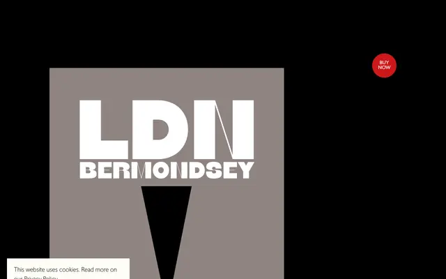
A single-weight high-contrast display sans with fine modulating strokes running vertically through the letter centres, designed by Paul Harpin as part of a paired London-themed headline series.
About
LDN Bermondsey is one half of a companion pair with LDN Borough, both built around the same outer letterforms but differentiated by where the fine contrast strokes fall. In Bermondsey, those strokes sit vertically at the centre; in Borough, they run horizontally at the top and bottom. That single structural difference yields two faces of markedly different character from largely shared architecture.
Classification
A high-contrast sans serif with fine contrast strokes positioned vertically at the centre of letters, giving it a distinctive modulated appearance despite its sans construction. Designed specifically as a headline display face.