Tangier
Lipton Letter Design · Richard Lipton · 2008
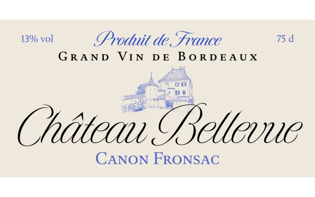
A Spencerian script family in four weights by Richard Lipton, drawn from historical catalog lettering and notable for a Black weight that pushes stroke contrast to its limit.
About
Inspired by lettering found on a catalogue cover, Tangier develops the Spencerian tradition across four weights from Light to Black, balancing exuberance with discipline. The Black weight is a particular point of distinction, testing the outer limits of contrast achievable in a script typeface. Glamour magazine adopted two weights for its 2008 redesign, lending the family a credible editorial pedigree.
Classification
A formal Spencerian-style script with high stroke contrast, inspired by historical lettering. The Black weight pushes contrast to an extreme, firmly placing it in the script category rather than display.