Shogun
Lipton Letter Design · Richard Lipton
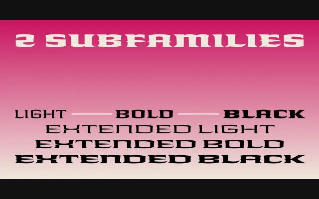
A six-style ornamental headline family in three weights and two widths, originating from a logotype commission by Los Angeles graphic designer Margo Chase.
About
Richard Lipton developed Shogun from a handful of characters drawn for a Chase logotype, expanding them into a coherent display family of Light, Bold and Black weights across Regular and Extended widths. The series sustains unusually consistent shapes and themes across all six styles, making it adaptable across a range of display applications. Lipton's four decades of calligraphic practice inform the letterform construction throughout.
Classification
A wide, ornamental headline series with strong decorative character, designed explicitly for display use across three weights and two width variants. Its origins in a logotype commission and its unusual repetition of shapes and themes place it firmly in the ornamental display category.