Riquet
Lipton Letter Design · Richard Lipton
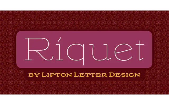
A wide, round display slab serif drawn from Ludwig Hohlwein's 1920s European poster lettering, available in six weights plus a variable font.
About
Richard Lipton expanded a handful of freehand capitals and lowercase letters from Hohlwein's poster work into a full typeface family with a deliberately casual, hand-inked quality. Six weights from Thin to Black are accompanied by a variable font, stylistic alternates and small capitals, giving designers a broad expressive range. The design suits packaging and branding where a period-inflected, quirky slab character is needed.
Classification
A wide, round display slab serif drawn from freehand lettering on Ludwig Hohlwein's 1920s–30s European posters, with a casual, hand-inked character that places it firmly in the display slab tradition.