Partiche
Lipton Letter Design · Richard Lipton
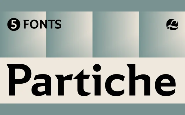
A geometric sans with calligraphic roots, shaped by Richard Lipton's 40-year background in letterforms and inspired by the graphic sensibility of Seymour Chwast.
About
Built on a monolinear geometric framework, Partiche introduces wedge-shaped terminals and sculptural spurs that betray Lipton's calligraphic training on closer inspection. Five weights are accompanied by a variable font, with small caps, stylistic alternates and old-style numerals rounding out a well-appointed character set. The combination of quiet eccentricity and solid legibility makes it serviceable for editorial work, book design and branding.
Classification
Described as an expressive sans serif built on a geometric framework with monolinear strokes at a distance, distinguished by wedge-shaped terminals and sculptural spurs derived from a calligraphic sensibility rather than pure geometry.