Panta Display
Lipton Letter Design · Richard Lipton
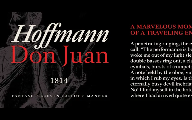
A calligraphically-rooted serif in three weights, inspired by W. A. Dwiggins' hand-lettered design work for Gargantua & Pantagruel, with dramatic italics and a warm mid-century character.
About
Richard Lipton's decades of calligraphic practice are visible in the subtle asymmetries and lively curves that give Panta Display its personality. Small caps, old-style and lining figures, and stylistic alternates add typographic depth suited to long-form book work. The editorial confidence of the italics extends its usefulness into magazine and literary publication contexts.
Classification
A calligraphically-informed serif with mid-century literary character, drawing on Dwiggins' hand-lettered work. Subtle asymmetries, lively curves and dramatic italics place it firmly in the humanist serif tradition with a warm, expressive quality.