Meno Text
Lipton Letter Design · Richard Lipton · 1994
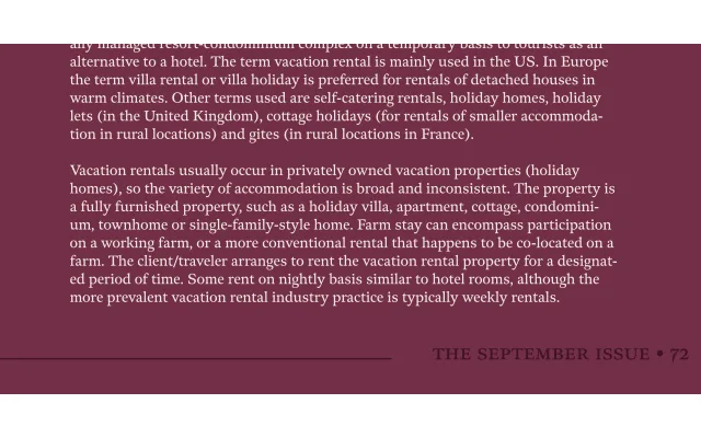
The text-optimised optical cut of Richard Lipton's Meno superfamily, rooted in the French baroque letter-cutting of Robert Granjon and the Dutch italic tradition of Dirk Voskens.
About
Meno Text offers three weights with matching italics, drawn for sustained reading at smaller sizes. The romans draw energy from Granjon's late 16th-century French baroque forms, while the italics trace their lineage to Voskens' 17th-century Amsterdam work. OpenType features include small capitals, old style figures, swashes and stylistic alternates that reflect Lipton's background as a professional calligrapher.
Classification
An old style serif drawing from French baroque forms cut by Robert Granjon in the late 16th century for the romans, and from Dirk Voskens' 17th-century Amsterdam work for the italics. The calligraphic heritage and bracketed serifs place it firmly in the humanist old style tradition.