Meno Display
Lipton Letter Design · Richard Lipton · 1994
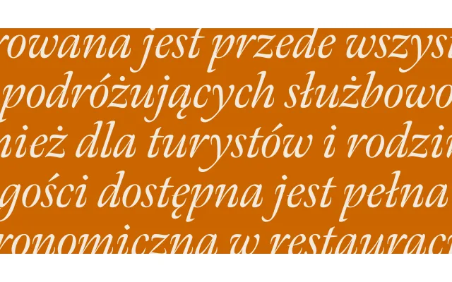
A calligraphically rooted old style serif in 36 display styles, drawing on Granjon's French baroque romans and Voskens' Amsterdam italics across three widths and six weights.
About
Designed by Richard Lipton in 1994 and expanded significantly in 2016, Meno Display is the large-size optical cut of a wider superfamily spanning Text, Display and Banner sizes. The romans take their energy from Robert Granjon's late 16th-century French baroque forms, while the italics follow Dirk Voskens' 17th-century Amsterdam tradition. Alternate glyphs, swashes and discretionary ligatures reflect Lipton's four decades as a professional calligrapher, giving the family particular depth for high-end editorial work.
Classification
Calligraphic old style serif drawing on French baroque forms from Robert Granjon (late 16th century) and the italics from Dirk Voskens' 17th-century Amsterdam work, placing it firmly in the humanist old style tradition with a strong calligraphic influence.