Meno Banner
Lipton Letter Design · Richard Lipton · 1994
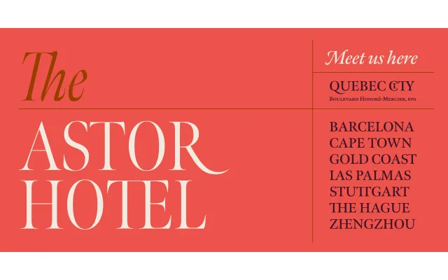
The display-optimised cut of Richard Lipton's Meno superfamily, drawing on Granjon's French baroque romans and Voskens' Amsterdam italics across 36 styles in three widths.
About
Meno Banner is the largest optical size within Lipton's 78-style Meno superfamily, first drawn in 1994 and expanded significantly in 2016. Six weights from Light to Black, each with a matching italic, are offered in standard, Condensed and Extra Condensed widths. The design's calligraphic origins show in its alternate forms, swashes and discretionary ligatures, making it well suited to high-end editorial headlines.
Classification
Old style serif with roots in French baroque letterforms, specifically Robert Granjon's late 16th-century cuts for the romans and Dirk Voskens' 17th-century Amsterdam work for the italics. Designed as an optical size variant optimised for banner and display settings, with condensed and extra condensed widths.