Hoffmann
Lipton Letter Design · Richard Lipton · 1993
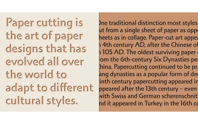
A five-weight display family drawn from paper-cut letterforms by Michigan lettering artist Lothar Hoffmann, digitised by Richard Lipton with Font Bureau in 1993.
About
The forms originate not from the pen or brush but from letters physically cut out of paper, giving the family an unusual sculptural quality among calligraphic typefaces. Lipton digitised the designs in 1993 with Font Bureau, producing four weights with expert sets and a Titling Black. OpenType features include small capitals, old-style numerals and common ligatures, lending it some versatility beyond strictly display use.
Classification
Derived from paper-cut lettering forms by Michigan lettering artist Lothar Hoffmann, the family carries a hand-crafted, calligraphic character that places it firmly in the display category rather than a conventional text serif or sans classification.