Bremen
Lipton Letter Design · Richard Lipton
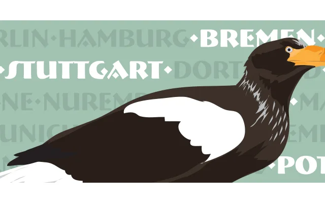
An all-caps display face originally designed for Font Bureau, drawn from Ludwig Holwein's sinuous hand-lettered poster capitals of 1922.
About
Richard Lipton based Bremen on freehand lettering from a 1922 Holwein poster, channelling the decorative energy of German and Austrian display typography from the 1920s and early 1930s. The family spans three weights – Light, Bold and Black – and is strictly uppercase in use. Its calligraphic origins give the letterforms a warmth and organic quality uncommon in purely geometric Art Deco revivals.
Classification
An all-caps display typeface drawn from 1920s German and Austrian poster lettering traditions, specifically Ludwig Holwein's sinuous freehand capitals of 1922. Its decorative, calligraphic character places it firmly in the display category with an Art Deco subcategory.