Bennet Display
Lipton Letter Design · Richard Lipton
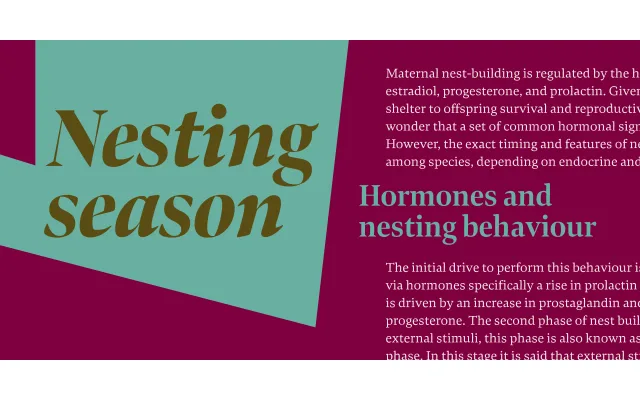
A wedge serif display family by Richard Lipton, born from a logotype commission and grown into 36 styles across three widths designed for precision headline fitting in editorial contexts.
About
Originally inspired by Moth Design's logotype for the North Bennet Street School in Boston, the family expanded well beyond its modest origins. Three widths — Regular, Condensed and Extra Condensed — each span six weights with matching italics, making the family well suited to newspaper and magazine headline hierarchies. Lipton's background in calligraphy informs the wedge serifs and the warmth of the letterforms throughout.
Classification
A wedge serif (also known as a Latin or stress serif) with calligraphic origins, characterised by triangular bracketed serifs. The display cut is optimised for headline setting across three widths.