Bennet Banner
Lipton Letter Design · Richard Lipton
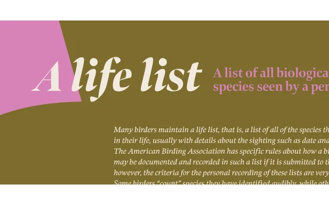
A calligraphically informed wedge serif designed for editorial headlines, offered across three widths and six weights with matching italics, totalling 36 styles in the Banner cut alone.
About
Inspired by Moth Design's logotype for the North Bennet Street School in Boston, the Banner subfamily sits within Richard Lipton's broader 96-font Bennet superfamily, tuned for display sizes. The three widths – Regular, Condensed and Extra Condensed – are intended for precise headline fitting in newspaper and magazine contexts. Lipton's four decades of calligraphic practice inform the wedge serif construction and the considered modulation of stroke weight across the range.
Classification
A wedge serif (also known as a stress serif or Latin serif) with calligraphic roots, designed explicitly for display and editorial headline use across three widths. The wedge-shaped serifs and stroke modulation reflect Lipton's background as a professional calligrapher.