 MegaMegaTypeType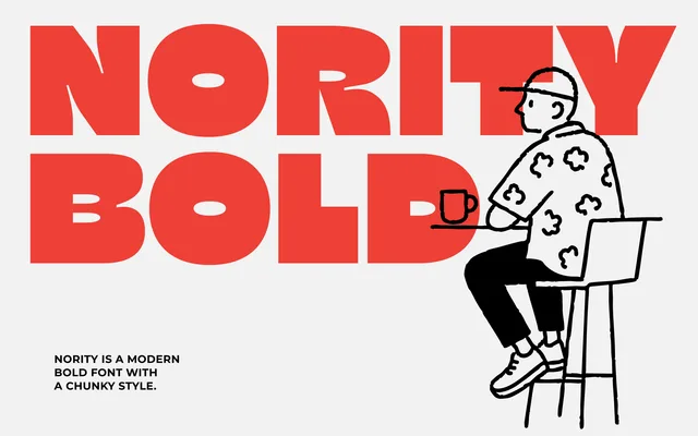
A chunky, geometric display sans with contemporary ink-trap cutouts, built for maximum impact at headline and logo scales.
About
Nority is a bold geometric display typeface built on near-square proportions and heavy strokes, punctuated by ink-trap cutouts that add character at large sizes. It comes in upright and slanted variants, covering the core display use cases – posters, packaging, logo work – where weight and personality carry the design. The compact, blocky forms read with confidence across print and screen.
Classification
Bold geometric display sans-serif with contemporary ink-trap cutouts at stroke junctions. Near-square proportions and heavy strokes throughout. Single weight; Slanted variant provides an oblique companion for display use.
Weights
Bold
Family
Nority Slanted
Languages
EnglishSpanishFrenchPortugueseDutchSwedishFinnishDanishNorwegianGermanItalianPolishCzechSlovakHungarianRomanianCatalanLatin Extended
Tags
displaygeometricinktrapboldchunkysquareheadlinelogoposterpackagingbrandingheavynovelty