 MegaMegaTypeType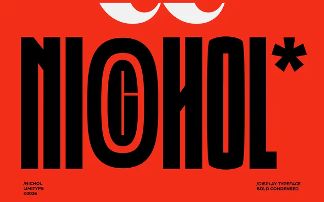
A bold extra-condensed display sans from Indonesian studio limitype, built for headlines and branding where sharp angular stems meet deliberate curves in a single commercial weight.
About
Nichol is a tightly condensed display sans-serif with one commercial weight, designed for headlines, posters, logos and editorial layouts where space economy matters. Its character comes from the tension between sharply cornered stems and the distinctive curves threaded through individual letterforms, lifting it above a plain geometric condensed. Extended Latin coverage (213 glyphs, OTF) makes it usable across Western and Central European markets, though with no italic and a single weight it suits display work only.
Classification
Modern condensed sans-serif with a single commercial weight. Construction is notable for pairing sharply angular stems and corners with distinctive curves at specific letterform junctions, giving it more character than a plain geometric condensed. Extra-condensed proportions, low-to-medium contrast, upright axis, open terminals. Visually reads as bold despite a weight-400 OpenType designation; the commercial file is named "Nichol-Bold-Condensed." Designed for display and headline use only — no text weight exists.