 MegaMegaTypeType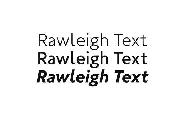
Rawleigh tuned for running text, Thin to Bold with italics.
About
Rawleigh Text keeps the classic geometric-humanist character of Rawleigh but stops at Bold and settles the details for paragraphs. The specimen runs the Mallard locomotive story at text sizes.
Classification
The text-optimised Rawleigh: seven weights from Thin to Bold with italics, tuned for longer settings.
Weights
ThinExtraLightLightBookMediumSemiBoldBold
Optical sizes and widths
Variable: wght 100–700, slnt 0 to -11
Family
Rawleigh Text VF
Languages
Latin
Tags
textbodyreadinghumanistgeometriceditorialvariable