 MegaMegaTypeType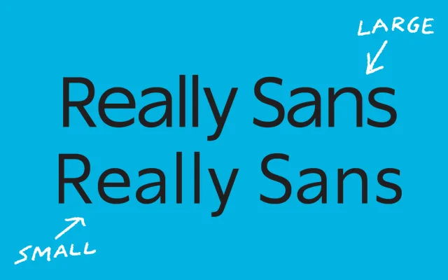
A 28-style sans with two genuine optical sizes — Large for display, Small for text — built around open terminations, a Hairline-to-Ultra weight range and broad multilingual coverage.
About
Really Sans addresses a straightforward design problem: sans serifs are called on at both display and text sizes, so the family ships two distinct optical variants rather than asking one design to do everything. The Large variant takes a geometric, tightly spaced approach suited to headlines; the Small pulls back the x-height and loosens spacing for legibility in body copy. Vertically cut terminations, round dots on the i and j, stylistic alternates and a full OpenType feature set — including multiple figure styles, dynamic fractions and directional arrows — give the family real depth across 200+ languages.
Classification
Two-optical-size sans serif family with distinct Large and Small variants. The Large has a higher x-height, tighter spacing and a more geometric construction for display use; the Small opens up spacing and lowers the x-height for running text legibility. Vertically cut open terminations and round diacritical dots align it with the geometric grotesque tradition. Weight range spans Hairline through Ultra in the Large optical size.