Welo Thin
Letterhead Fonts · Patrick Kalange
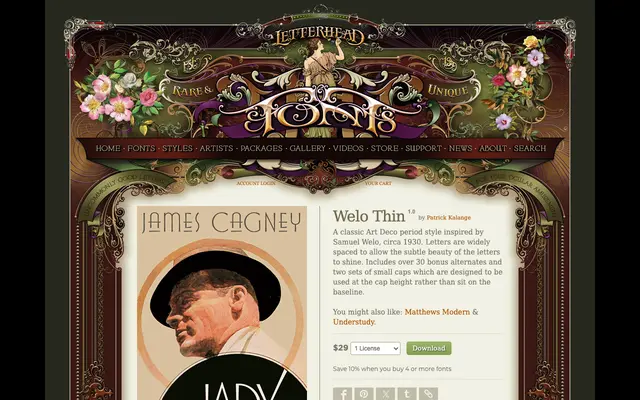
A single-weight Art Deco display face by Patrick Kalange, drawn from the lettering style of Samuel Welo circa 1930, with wide spacing, over 30 alternate glyphs and two sets of small caps.
About
Inspired by Samuel Welo's letterwork of the 1930s, this face uses wide letter-spacing to give each character room to be read individually. Over 30 bonus alternates extend the palette for titling and display use, while two sets of small caps are designed to sit at cap height rather than on the baseline. It is a single-weight offering, making it best suited to headline and decorative applications.
Classification
A display typeface in the Art Deco tradition, inspired by lettering artist Samuel Welo's circa-1930 style. Wide spacing and refined letterforms place it firmly in the decorative display category.