Trolley
Letterhead Fonts · Mark Searfoss
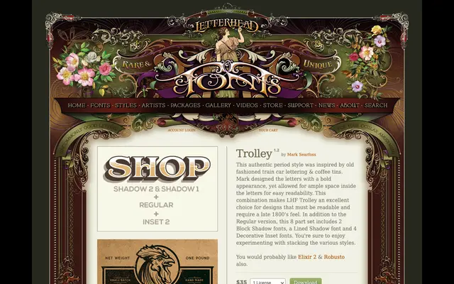
A bold late-1800s display type drawn from train car lettering and coffee tin graphics, sold as an eight-part layering system with shadow and decorative inset variants.
About
Designed by Mark Searfoss, Trolley pairs a heavy, open letterform with generous interior counter space to maintain legibility at display sizes. The eight-font set includes one regular, two block shadow fonts, a lined shadow and four decorative inset fonts, all intended to be stacked for layered chromatic effects. The result is a period-appropriate toolkit suited to labels, signage and packaging with a Victorian or Edwardian commercial flavour.
Classification
Bold period-style display type inspired by late 19th-century train car lettering and commercial packaging, designed for layering with shadow and inset decorative variants.