State Fair
Letterhead Fonts · Mike Jackson
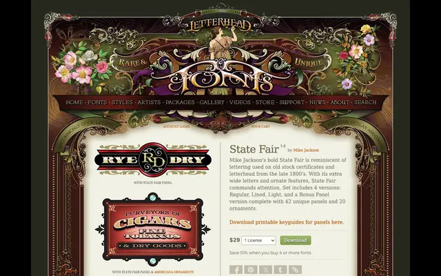
An extra-wide Victorian display typeface evoking late 19th-century stock certificates and letterhead, supplied in four stylistic versions with an extensive panel and ornament set.
About
Designed by Mike Jackson, State Fair draws on the ornate lettering of American commercial printing from the 1880s and 1890s. The set includes Regular, Lined, Light and Light Alternates cuts, alongside a Bonus Panel version offering 42 unique panels and 20 ornaments for compositional flexibility. Its extended letterforms and decorative detailing suit period-themed signage, packaging and editorial work.
Classification
A wide, ornate display typeface in the tradition of Victorian stock certificate and letterhead lettering, with extra-wide proportions and decorative features typical of late 19th-century wood type and engraving styles.