Spindly
Letterhead Fonts · Mark Searfoss
displayVernacular display
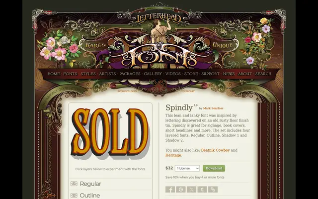
A tall, lean display face by Mark Searfoss, drawn from lettering found on an old floor finish tin and sold as a four-font layered set.
About
Inspired by rusty tin-can lettering, Spindly has a spindly, elongated structure suited to signage, book covers and short headlines. The family ships as four layered fonts – Regular, Outline, Shadow 1 and Shadow 2 – which can be stacked to produce dimensional effects. Bonus alternate glyphs extend the typographic options beyond the base character set.
Classification
A tall, narrow decorative display face with a vernacular hand-lettering heritage, designed for signage and headline use. The layered system of Regular, Outline and two Shadow fonts places it firmly in the display category.
Weights
Regular
Languages
Latin
Tags
displaylayeredsignagevintagevernacularheadlineretrodecorative