Silent Movie
Letterhead Fonts · John Studden
A two-font set inspired by the monotone brush lettering used for silent-film title cards in the early 1900s, designed to replicate the uniform stroke weight that film transparency demanded.
About
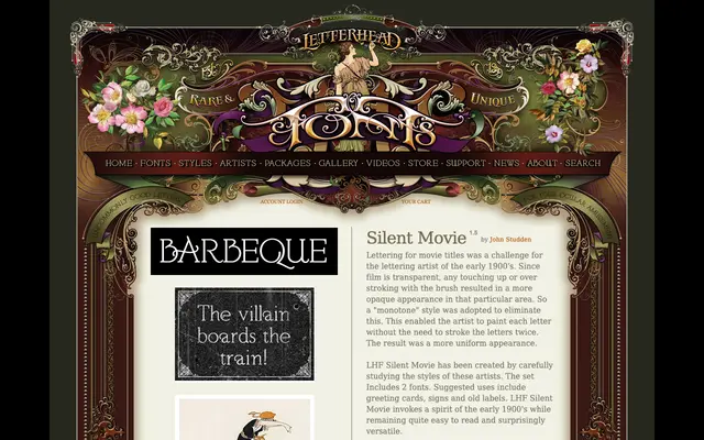
Early film title artists adopted a monotone painting technique to avoid the opaque patches caused by double-stroking on transparent film stock, and Silent Movie draws directly on that constraint. The family ships as two fonts: the first suited to all-caps settings for a direct, masculine tone, the second better used in mixed case for a more approachable feel. Suggested applications include greeting cards, signs and period-style labels.
Classification
A monotone display face inspired by early 20th-century film title lettering, with even stroke weights that eliminate double-brushing. Sits firmly in the display category owing to its decorative historical character and limited suitability for body text.