Sanborn Thin
Letterhead Fonts · David Parr
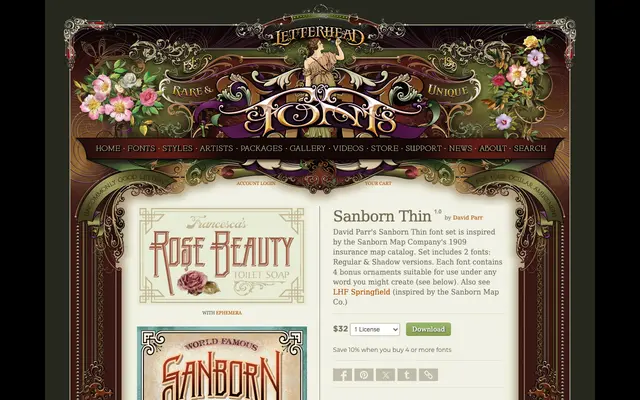
A two-font display set drawn from the Sanborn Map Company's 1909 insurance map catalog, offering a Regular and a Shadow version with four decorative ornaments.
About
Inspired by the lettering found in the Sanborn Map Company's 1909 cartographic catalog, this set captures the thin, elegant character of early twentieth-century map titling. The Regular and Shadow versions can be layered for depth, and four bonus ornaments are included for use beneath composed words. It sits alongside LHF Springfield as part of Letterhead Fonts' broader interest in Sanborn-era Americana.
Classification
An ornamental display typeface inspired by early twentieth-century cartographic lettering, with a companion shadow version typical of sign-painted and map titling styles of the period.