Prince
Letterhead Fonts · John Studden
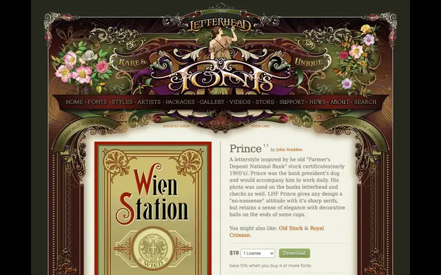
A display serif drawn from early 1900s American bank certificate lettering, pairing sharp serifs with ball-terminal capitals for a formal yet ornate character.
About
Inspired by the stock certificates of the Farmer's Deposit National Bank, Prince combines rigid, angular serifs with decorative ball terminals on select uppercase letters. The result sits between stern commercial typography and restrained elegance, suited to period-appropriate branding or formal display work. The name references the bank president's dog, whose image appeared on the bank's letterhead and cheques.
Classification
A decorative display serif with sharp, pronounced serifs and ornamental ball terminals on certain capitals, rooted in early 20th-century American bank and commercial lettering traditions.