Lumber Mill
Letterhead Fonts · Mark Searfoss
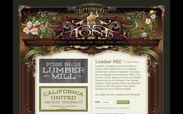
A period-style display typeface by Mark Searfoss, modelled on late-19th-century signage lettering and sold in three non-layering variants: Regular, Outline and Shadow.
About
Designed to complement vertical fonts and scripts, Lumber Mill draws on the workhorse lettering commonly found on signage from the late 1800s. The family comprises three separate fonts – Regular, Outline and Shadow – which are not intended to be stacked or layered. Twenty-eight bonus alternate glyphs are included across all versions.
Classification
A late 19th-century period-style display typeface with a vertical, condensed structure typical of signage lettering from the 1800s. Its workhorse character and companion variants (Outline, Shadow) place it firmly in the display category.