Fine Cut
Letterhead Fonts · John Studden
displayvintage display
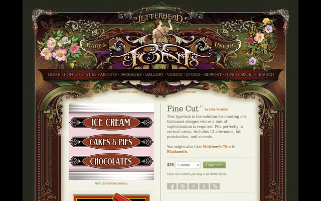
A display typeface by John Studden designed for period-style lettering, with 13 alternates and a vertical orientation suited to old-fashioned signage work.
About
Fine Cut is built for designs that call for a nostalgic character without sacrificing a degree of refinement. Its proportions favour vertical layouts, making it well suited to panels, labels and signage compositions. The family ships with 13 alternate glyphs, full punctuation and accented characters.
Classification
A decorative display typeface designed for period-style lettering with a vertical orientation, placing it firmly in the display category with a vintage or old-fashioned aesthetic.
Weights
Regular
Languages
Latin
Tags
displayvintagedecorativeretroverticalornamentalsignageoldstyle