Emporium
Letterhead Fonts · Mark Searfoss
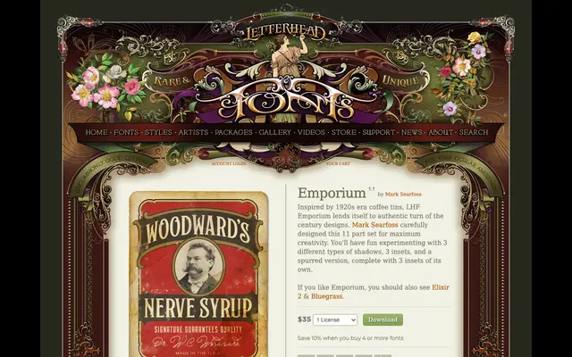
An 11-part ornamental display set drawn from 1920s coffee tin lettering, offering three shadow variants, three insets and a spurred version with its own insets for layered vintage compositions.
About
Designed by Mark Searfoss, Emporium is built for authentic turn-of-the-century aesthetics, drawing direct inspiration from early twentieth-century American packaging and sign-painting traditions. The family splits across two base styles – Regular and Spurs – each supported by multiple layerable companions providing shadows and insets. The modular structure gives designers considerable freedom to construct period-appropriate lettering arrangements.
Classification
A multi-part ornamental display family inspired by 1920s American lettering traditions, offering shadow, inset and spurred variants typical of decorative sign-painting and vintage packaging typography.