Claretian
Letterhead Fonts · Rob Cooper
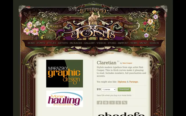
A sign-art display face by Rob Cooper with thin-to-thick stroke contrast and an elegant, hand-lettered character.
About
Designed by sign artist Rob Cooper, Claretian draws on traditional sign-painting technique, using modulated thin-to-thick curves to give the letterforms a pleasing, fluid rhythm. The family includes numerals, full punctuation and accented characters. Its stylish appearance suits display use in branding, packaging and editorial contexts where a hand-crafted quality is needed.
Classification
A display script or lettering typeface with thin-to-thick stroke contrast, typical of hand-painted sign art traditions. The stylish, fluid character forms place it firmly in the display category associated with sign lettering rather than conventional text typography.