Castlerock
Letterhead Fonts · David Parr
displayGothic display
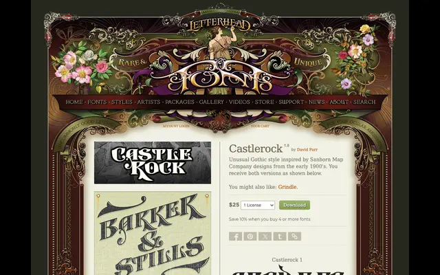
A two-variant Gothic display face drawn from early 1900s Sanborn Map Company lettering, designed by David Parr.
About
Castlerock takes its cues from the distinctive hand-lettered Gothic style found on Sanborn fire insurance maps produced in the early twentieth century. The family ships as two stylistic versions, giving users a degree of variation for titling and decorative applications. Its vernacular source material lends it an authenticity that separates it from generic Gothic revivals.
Classification
A decorative Gothic-influenced display face inspired by early 1900s Sanborn Map Company lettering, placing it firmly in the display category with historical vernacular Gothic references rather than traditional blackletter.
Weights
Regular
Family
Castlerock 1Castlerock 2
Languages
Latin
Tags
gothicdisplayvintagevernacularhistoricaldecorativesanbornmaps